The 5 principles of interior design

The combination and usage of the elements and principles of interior design will allow the creation of perfect interiors, delivering a well-designed space. The principle of design can be defined as the tools that the interior designer will use to develop ideas and bring a project to life.
Balance
This principle is extremely important to create a space visually pleasant that transmits a feeling of equilibrium and stability.
In order to achieve the perfect balance, we want to play around with negative and positive elements, bringing them together to create a homogenous composition.
We have different types of balance, depending on the space we are working with and the result we want to achieve this can be:
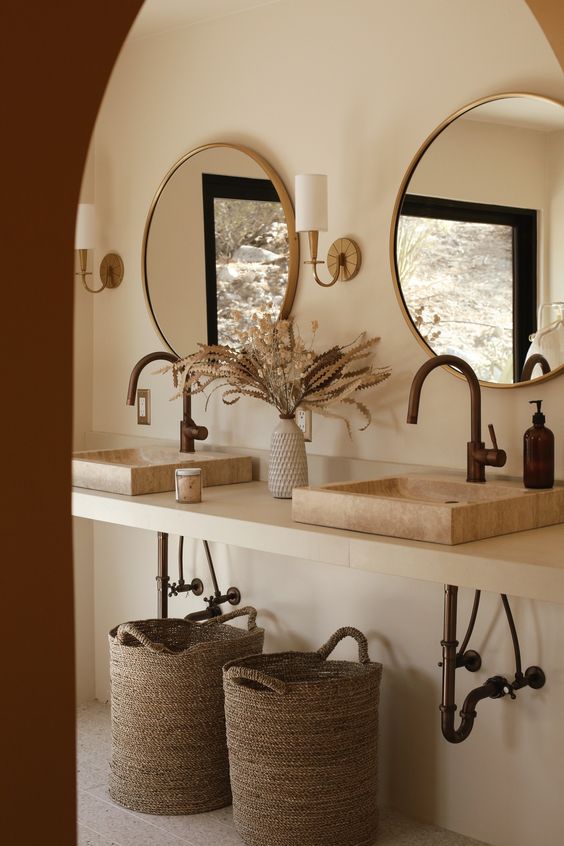
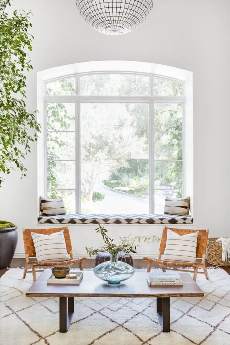
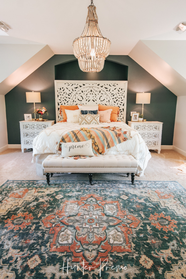
- Symmetrical - Equal distribution of visual weight and usage of mirrored elements on either side. A practical example could be the positioning of two nightstands on each side of the bed or two pendant lights on each side of a bathroom mirror. This type of balance is very pleasant to the eye, transmitting a sense of cohesion and harmony between elements. Important to mention, that too much symmetry isn't good as it could result in a boring and flat overall composition. The usage of colours and furniture re-arrangements can help break up the symmetrical pattern adding character and personality to the space.
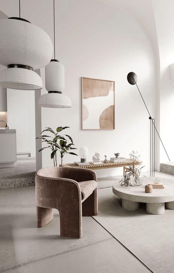
- Asymmetrical - Unequal distribution of visual weight where focal points and designed elements aren't evenly balanced. This type of balance is more creative and adds movement to the composition. In opposition to symmetrical, an asymmetrical balance involves the usage of different-sized elements unequally distributed within the room, but that still complete each other creating an appealing visual effect. For example, a large element on one side can be combined and balanced by a composition of smaller elements on the other side. Important to note that the choice of elements should still have a common denominator, like a similar color palette, for example, to avoid a cluttered effect.
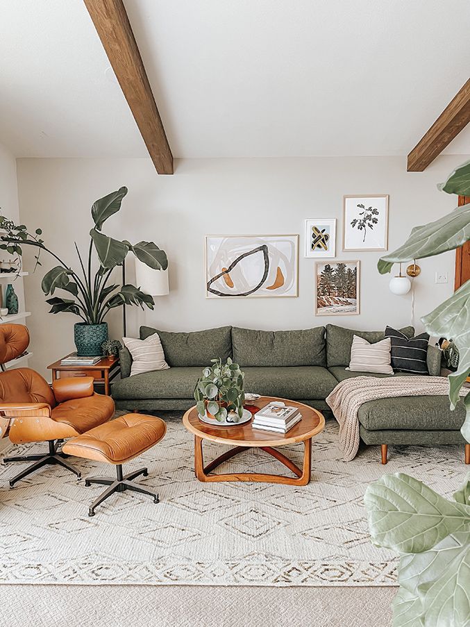
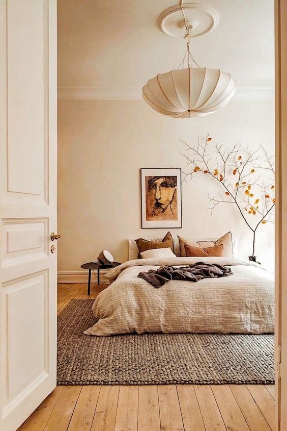
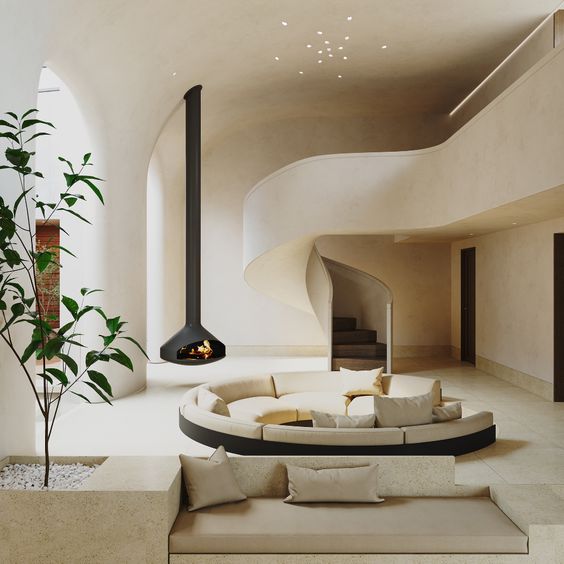
- Radial - Circular arrangements around a specific central focal point extending either inward or outward. Some examples are the distribution of chairs around the table, couches and seating fixtures around a coffee table, or a lighting fixture upon a dining table. This type of balance is great to create and draw attention to the desired focal point.
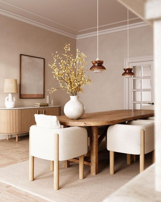
Rhythm
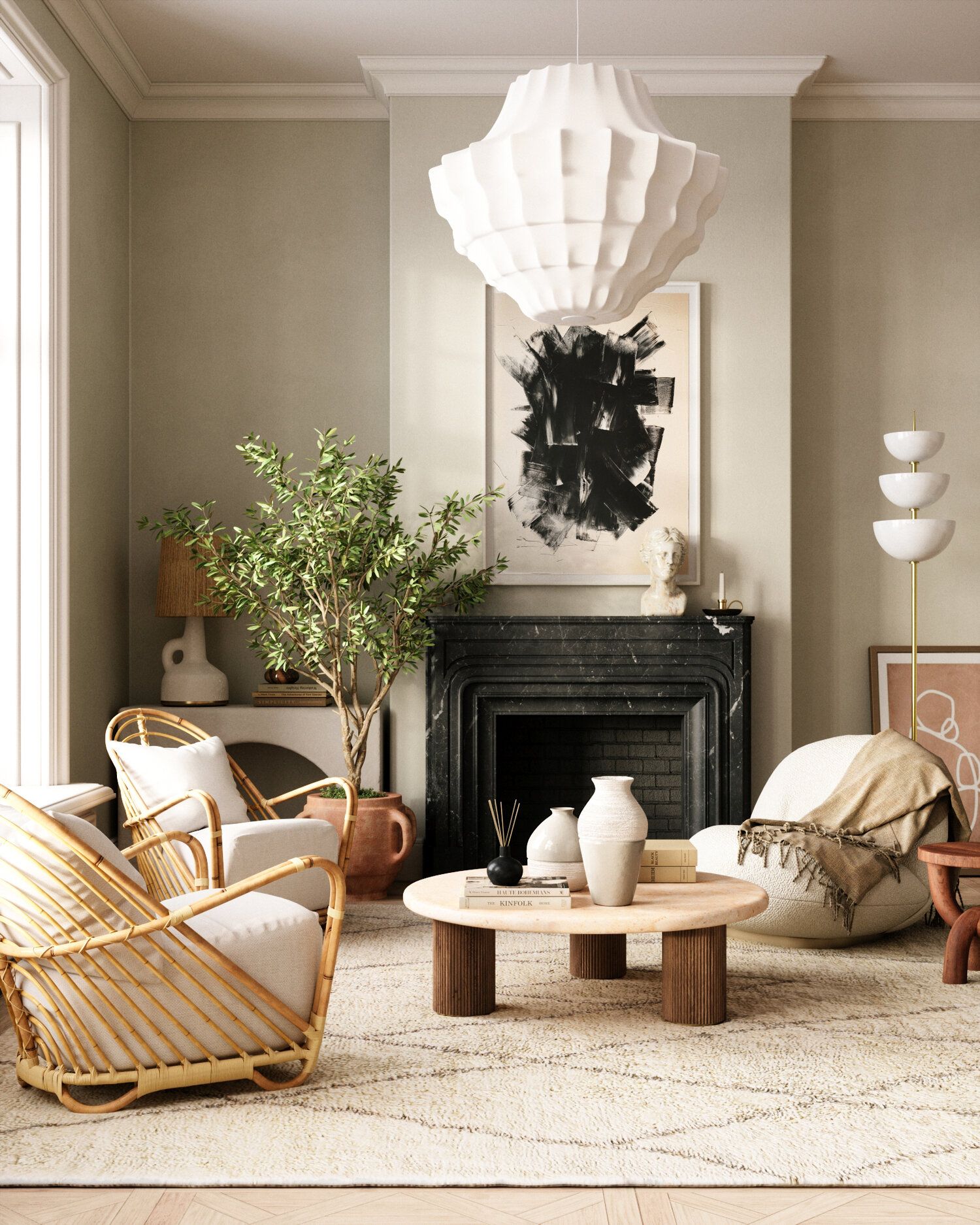
Rhythm in interior design is created by the repetition of different elements like colours, patterns, textures, and finishes. The result is to add movement to the composition and lead the eye across the space creating visual interest. This can be applied in a bold way to establish a focal point, to achieve a specific effect or, applied in a more subtle way.
Rhythm can be achieved by using the following methods:
- Repetition - this can be easily applied just by using any design elements like line, shape, color, texture, pattern, and light, more than once. This is an easy way to lead the eye as we please and, at the same time, create a sense of stability and cohesion.
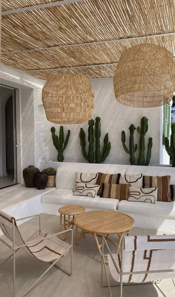
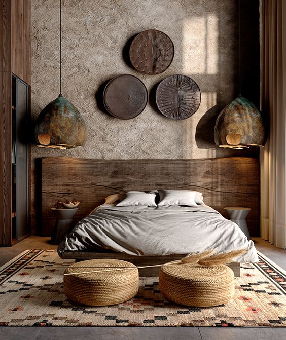
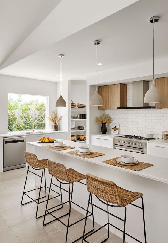
- Alternation - this is the usage of two or more elements alternating in a regular pattern. We can use an alternation of elements in opposition to each other to create a greater sense of movement.
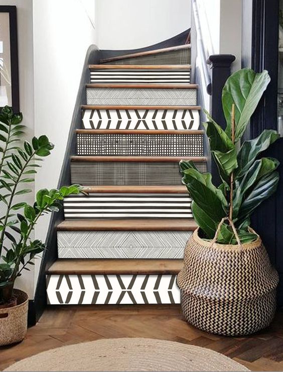
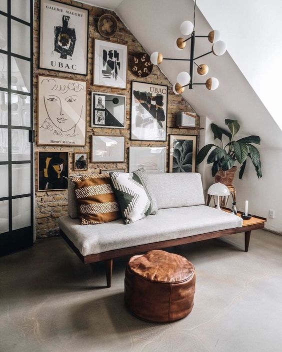
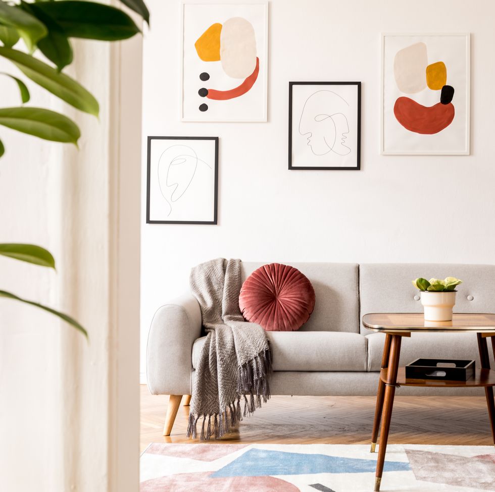
- Progression - this effect can be achieved by using, for example, color graduation or objects from small to large or low to high. This is a gradual change that leads the eye in a subtle way from one point to the other.
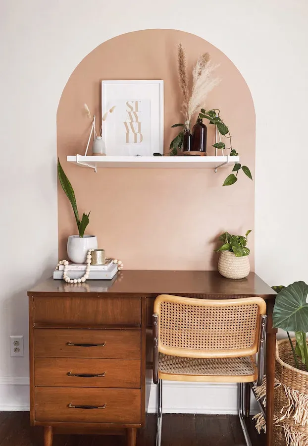
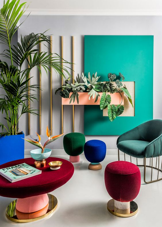
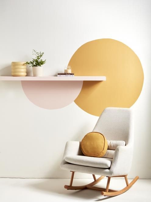
Finally, we can achieve rhythm in many different ways by using colourful pillows, rugs, and art pieces, for example, but also by using finishes, lighting fixtures, and decorative objects. Let your eyes dance to the design rhythm!
Emphasis
The emphasis in the room is to create the main focal point, basically where your eyes are more attracted. This is used to highlight a specific area or architectural feature but also to lead the eye away from an area of less interest. Examples of emphasis can be a fireplace, vaulted ceilings, ornate mouldings, a statement floor, picture windows to highlight an interesting view, arches, and much more.
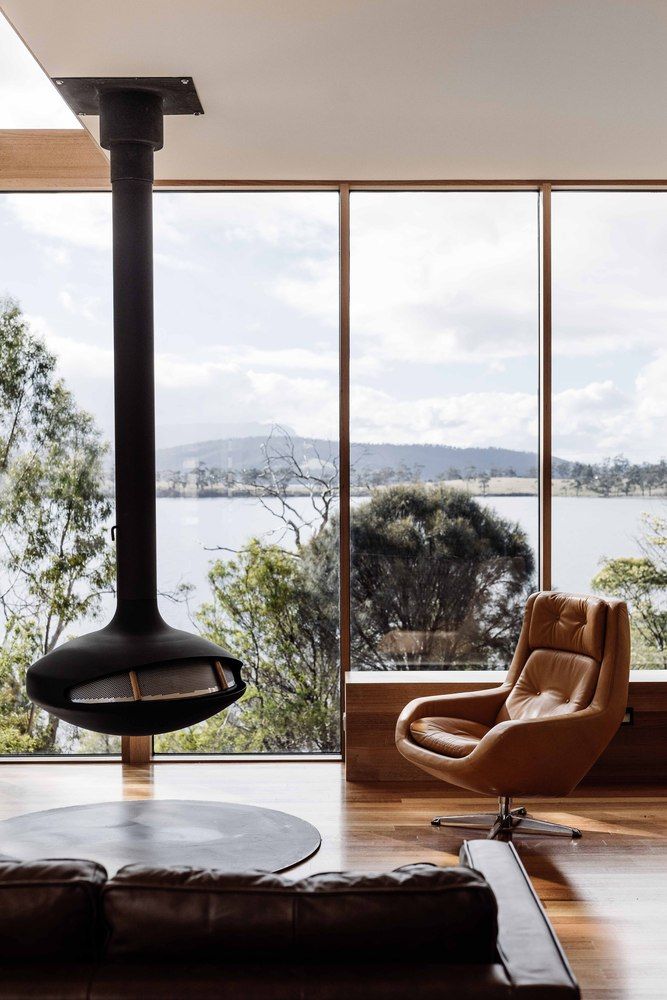
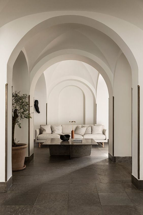
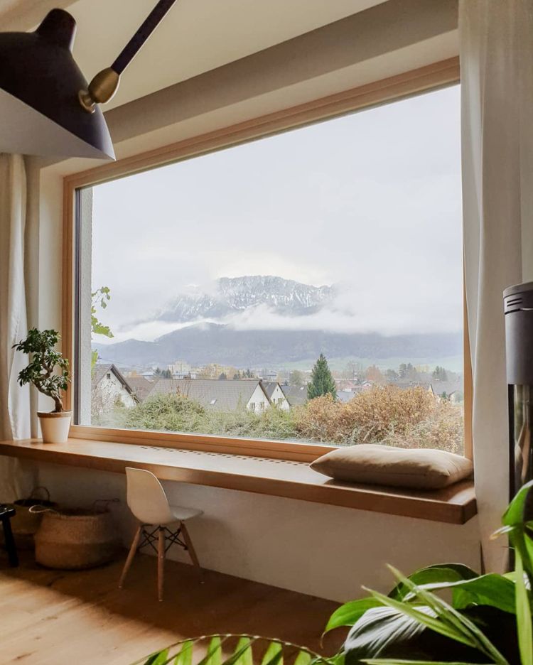
If we don't have a particular focal point, we can always create one, by using a statement piece of art or composition, an accent wall, a piece of furniture, or a lighting fixture.
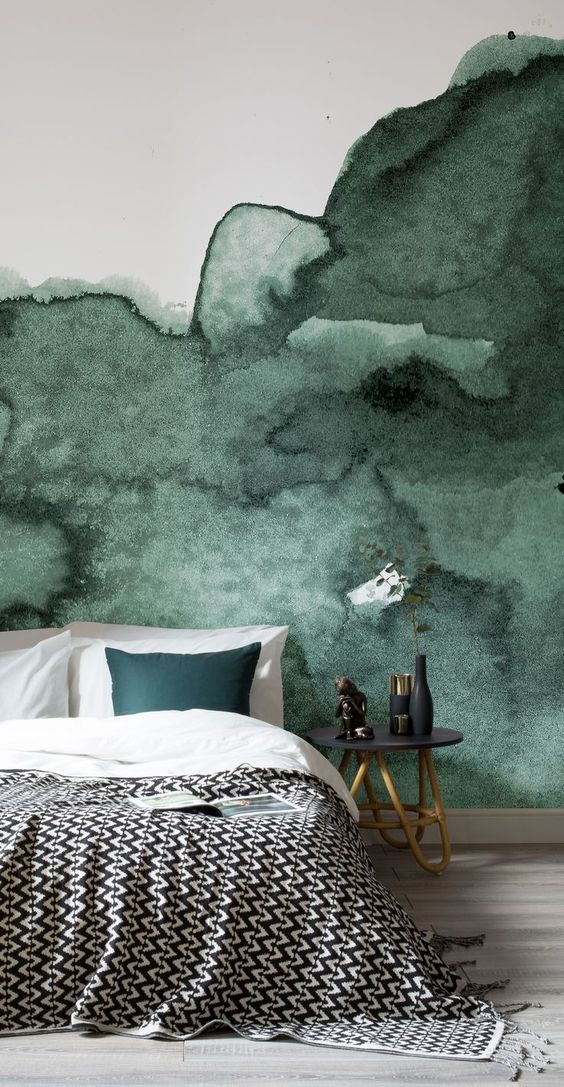
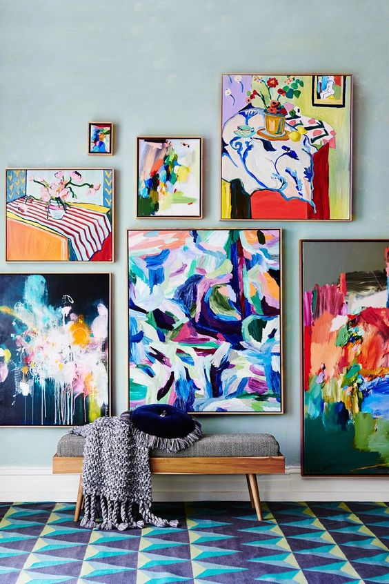
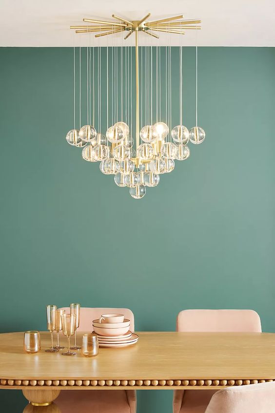
The desired outcome of using the principle of emphasis, in your composition, is to create interest and draw attention to the room "wow!" factor, making a great and unforgettable impression!
Proportion & Scale
Proportions and scale are essentials in interior design as they allow to balance all the elements and understand how they fit together within the space. It's important to choose proportioned furniture, keeping into consideration architectural features, ceiling heights, focal points, window fixtures, and, of course, the space square footage.
A great tool to make sure we're on the right path is the Golden Ratio. This has been used for many years as a mathematical sequence and is found in nature, for example, in the human body proportion.
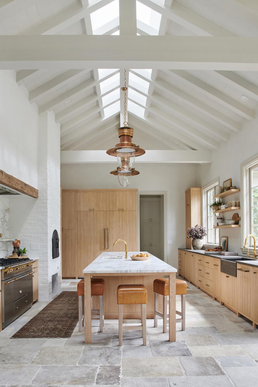
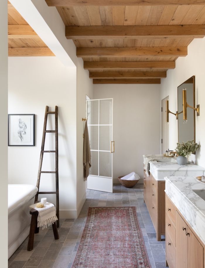
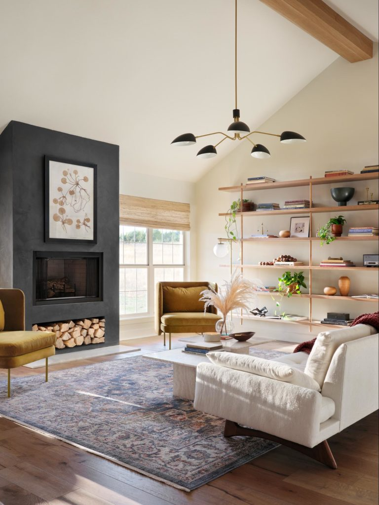
The Golden Ratio is 1:1.618 with a ratio of roughly 60/40 also called the 60/30/10 rule. This rule is easy to apply and its results will be a perfectly balanced composition. This can be applied to furniture, colors, and patterns.
Colour is a great an easy way to better understand this small mathematical formula. For example, a balanced and appealing color palette is formed by the combination of 3 colors following the 60/30/10 rule:
- 60% of the room should be decorated with the primary color, for example, the walls or large furniture
- 30% with the secondary color, like curtains, rugs, and textiles
- 10% with the accent color, small accents, and accessories
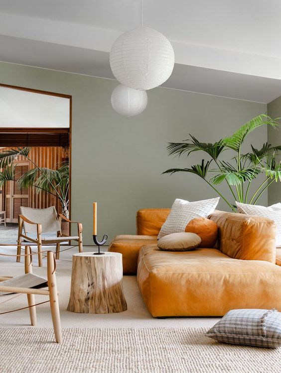
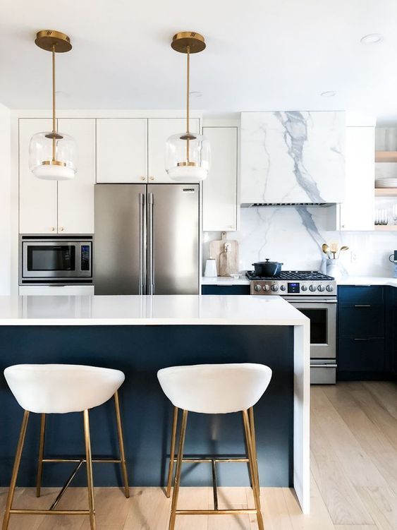
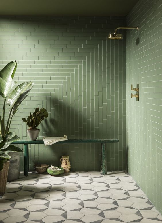
In conclusion, to achieve that appealing composition, you can apply the Golden Ratio to pretty much everything, create contrasts, make good use of positive and negative space, use a focal point, combine patterns, and pay attention to the room layout and architectural features.
Harmony
Harmony is the combination of similar components, creating a sense of unity and belonging. The more similarities the more harmony will be achieved, however, too much unity can also feel flat and predictable. At times, even the most colorful and eclectic compositions can transmit a sense of harmony, rules have been broken, yes, but a common denominator can be found to create a visual connection.
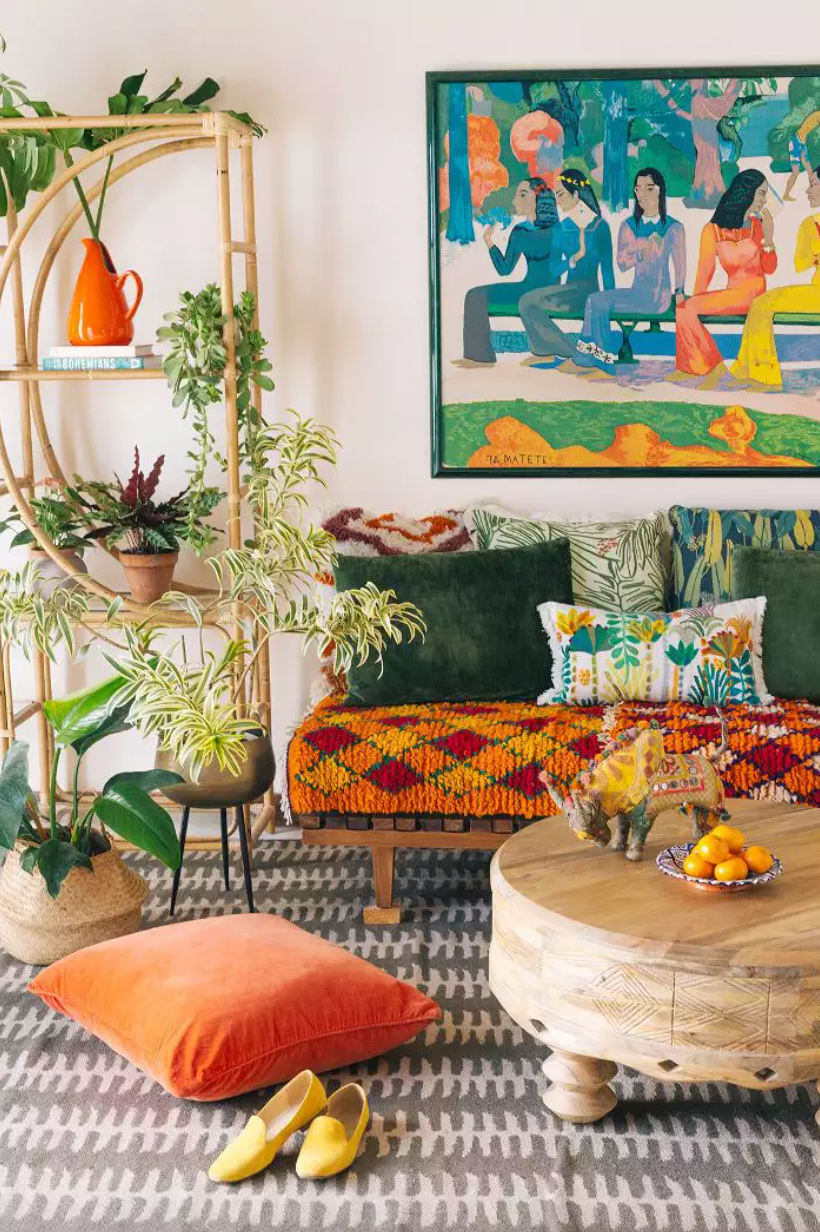
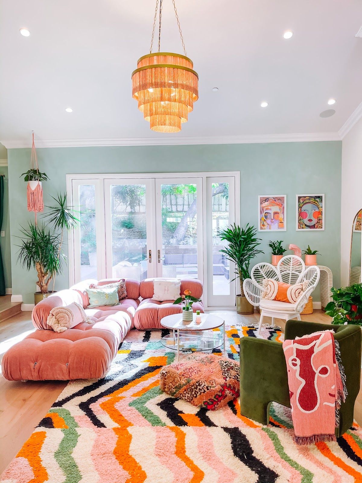
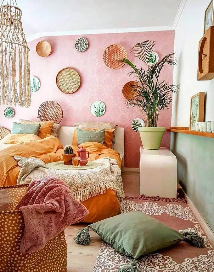
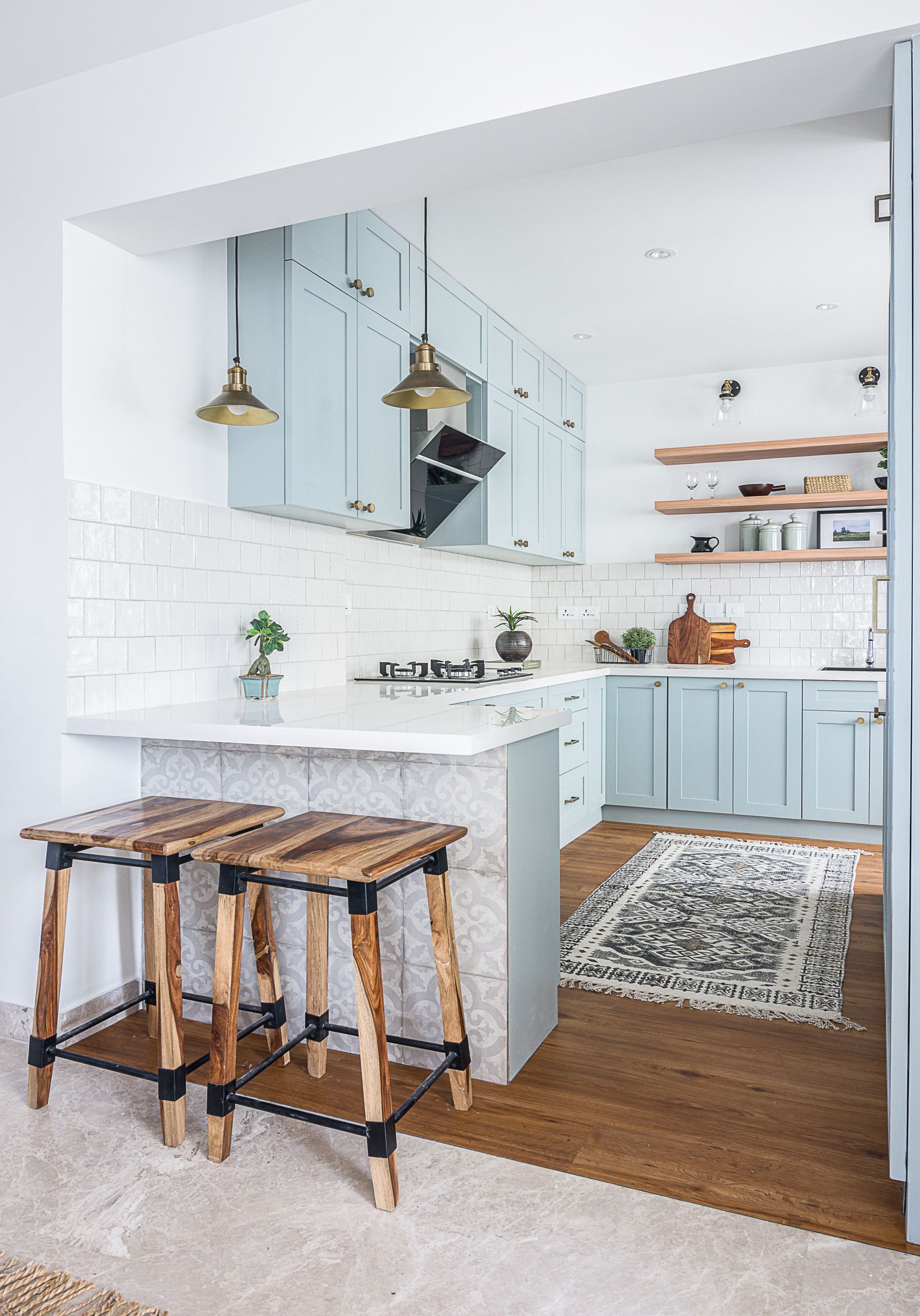
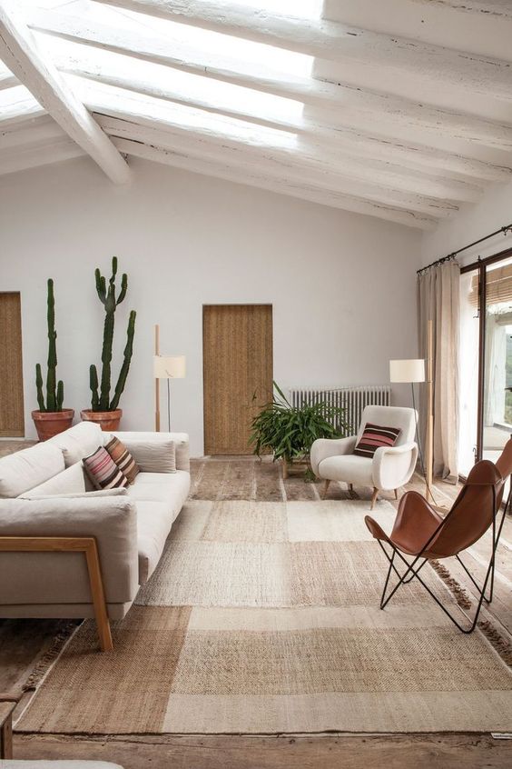
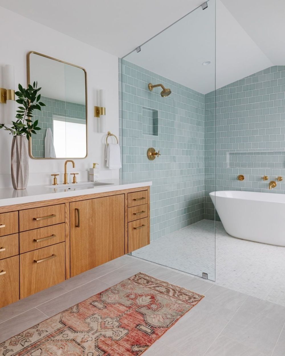
To achieve harmony we can use some of these elements like shapes, colors, textures, materials, dimensions, and styles. This principle is extremely important to create a cohesive design within a single room or across the entire place.
“If you want a golden rule that will fit everything, this is it: Have nothing in your houses that you do not know to be useful or believe to be beautiful.” – William Morris
